Speed diagram
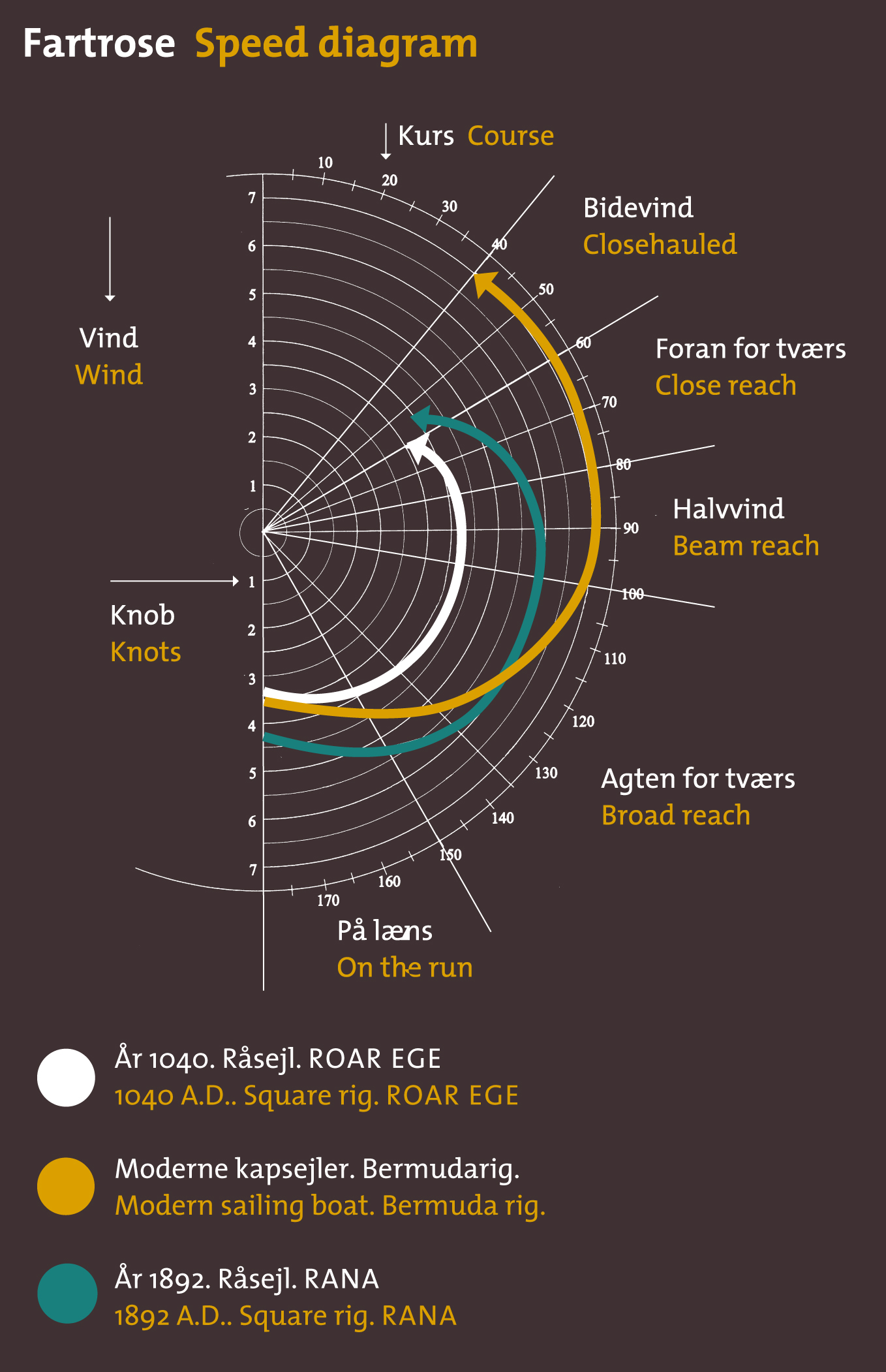
The speed of a sailing ship is dependant on many factors. Some of these are difficult to control in an experiment; for example the skill of the crew and, in particular, the helmsman, the height and wave length of the waves as well as the ship’s own weight. We have recorded the other variables: Wind direction, wind force and sail area. The dependence of the speed on these variables can be depicted in a so-called speed diagram. The speed diagram is a polar diagram, i.e. "a circular system of co-ordinates" – with the wind’s eye, the direction from which the wind is blowing, as zero (upwards) and one of the axes increasing 180º in each direction. The second axis of the co-ordinate system departs from the centre and shows the speed of the ship on the given course to the wind. (Tip: You will need to calculate the relative wind direction – the angle between the ship’s steered course and the wind direction.)
In the speed diagram a series of wind directions and speeds at the same wind speed and area of sail is plotted and a course drawn between the points. If one assumes that the ship’s sailing abilities on both tacks (with the wind from both sides) are equal, the curve will be symmetrical and it is permissible to use records from both tacks on the same side of the diagram. Accordingly, it is also sufficient to draw up half of the diagram. There may well be several curves – corresponding to several wind speeds, areas of sail or different vessels – on the same diagram.
Download, unzip and open the navigation data from the voyage. Sort the data according to wind speed and area of sail and plot one or more series in a speed diagram.
- What can be said of the speed relative to the speed of the wind? On which course to the wind does the ship sail fastest?
- Why is it not fastest with the wind directly astern? (Find the answer elsewhere on the website.)
- The so-called VMG (velocity made good), the effective speed as the crow flies against the wind, can also be read off the speed diagram – how?
The speed diagram is a good tool for calculating travelling speed and hereby operational radius with various wind directions. If you know how much water and food a given crew consumes per hour, the speed diagram can be converted to an operational radius diagram. This is how the game Sea Stallion Attack here on the website was made.
- Make your speed diagram in a spreadsheet. Find the necessary information concerning cargo carrying capacity, crew, consumption of supplies etc. here on the website (tip: play the game!) and make your own version of the game in the form of a spreadsheet which allows you to vary the quantities of food and drink and the size of the crew, and calculate an operational radius diagram on the basis of this. Then try to build maximum and minimum values for the size of the crew into the spreadsheet.
- Now try playing the game Sea Stallion Attack in the safe mode: Use your knowledge of the relationship between crew, supplies and operational radius with different wind directions to calculate your way through the game – then it is only a sudden shift of wind and lack of concentration at the helm that can prevent you from winning!
A series of exercises has been produced which aim to analyse The Sea Stallion’s handling abilities under sail and oar power respectively. In other words, the pupil is able to carry out him- or herself much of the research which the Viking Ship Museum is to embark upon after the voyage to Dublin. The exercises are best tackled in the order shown, and it is a good idea to present the results together in a final report.
The data set to be processed comprises the ship’s geographic co-ordinates (recorded with the aid of a GPS) as well as a series of other navigational and meteorological measurements. All of this is assembled in a zipped, semicolon separated text file Datalogger which can be downloaded from Tools in the right hand column of the exercise. This table can be used as the basis for a large number of exercises involving data validation, source criticism, searching and sorting, calculations and column updates and much more. The exercises are best executed with the aid of a spreadsheet and/or GIS and can be incorporated in a wider teaching context dealing with, for example, the GPS system, statistics and cartography.
The speed diagram is a very direct expression of the ship’s handling abilities and is a good example of a practical application of a polar diagram. The core of the exercise lies in sorting of the data so the individual curves only contain measurements taken at the same wind speed and sail area. You could also choose to concentrate on the dates 2nd - 3rd August when, off Lagavulin, circular experimental sailing exercises were carried out with the aim of producing a speed diagram. Remember to calculate the angle between the wind direction and the steered course as in Tacking abilities.
Subjects: Maths, physics, geography, general study.
Level: Sixth form/A level.
Tools
- Datalogger 14.zip
- Navigation data Roskilde-Dublin